

Microsoft PowerPoint can be a great classroom tool….if you use it well. In this post, I’ll help you avoid death by PowerPoint with a step-by-step guide to transforming your PowerPoint designs. I’ll explain some essential design principles and share with you my favorite image sites and fonts.
1. Less is More
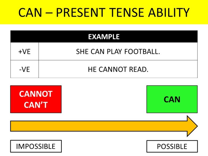
The biggest PowerPoint mistake is to put too much content on each slide. Take a look at this slide I made when I was first teaching at the YMCA in Chiang Mai:
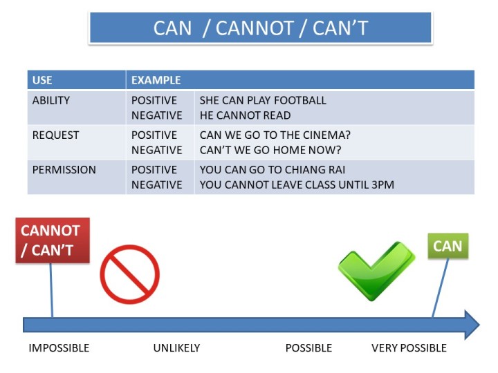
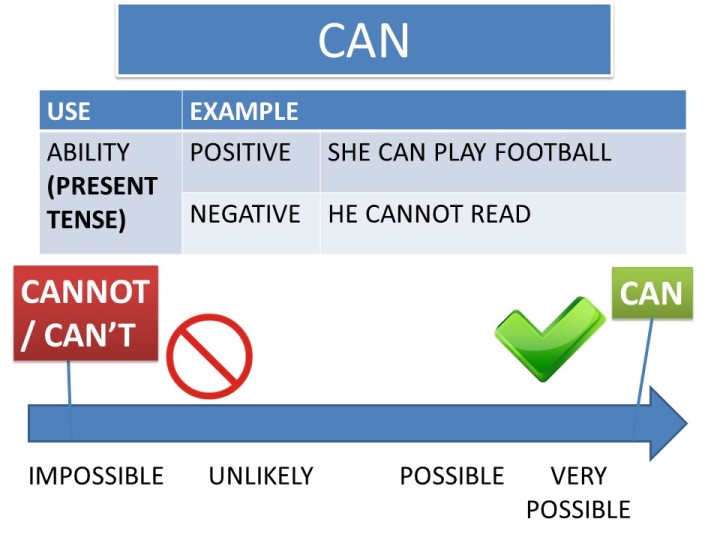
This slide has way too much content – there are three uses of the target language plus six examples, and it has a diagram too! Leaving aside any other design and teaching considerations, this would be a lot better as a series of slides dealing with each usage separately. Something like this, perhaps:


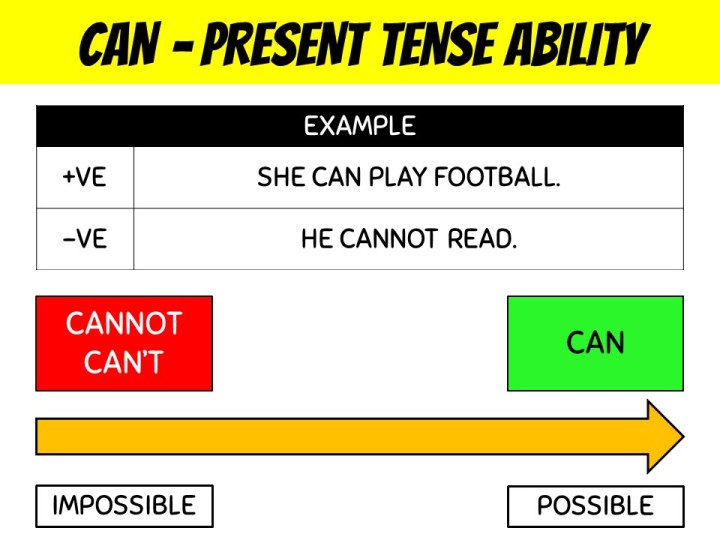
2. Bigger is Better
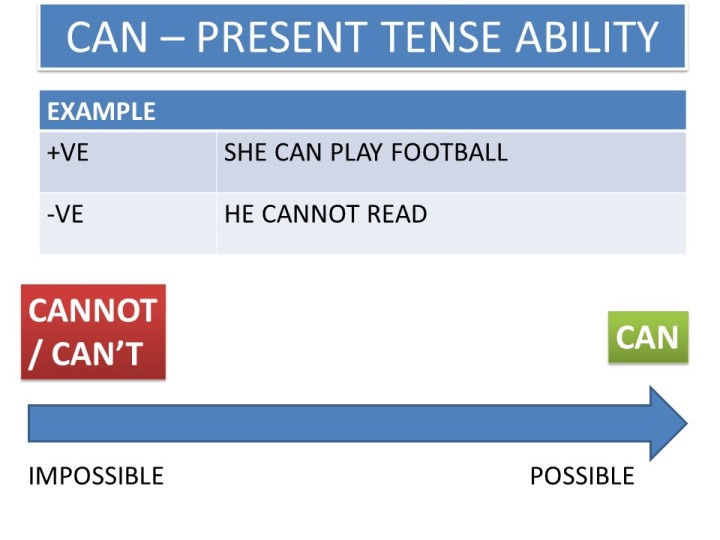
Once we’ve reduced the amount of content on a slide, we can now make it readable for that student at the back who never wears their glasses, so lets up those font and image sizes:
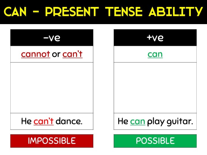
3. Reduce Wasted Space
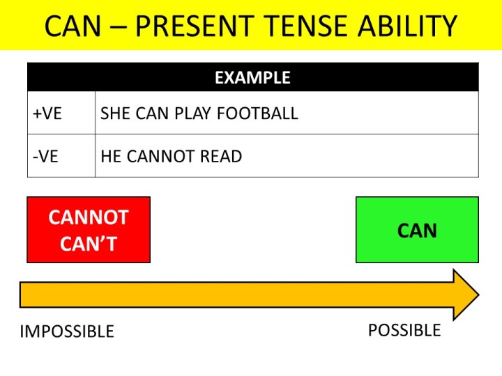
By which I don’t mean fill up the white space with more content! In PowerPoint, white space is good – we want slides that are uncluttered, simple to read and easy follow, so we need to think about more efficient ways of displaying our chosen content and whether everything onscreen is necessary. In this example, I think:
- The prohibited sign and the tick are unnecessary duplications – we’re already giving the same message using green and red text boxes – so let’s delete them.
- We’ve got a lot of wasted space in the title bar – we could give a more descriptive title and remove some of the text from the body of the slide.
- ‘very possible’ is unnecessary….and probably grammatically wrong anyway – I have a feeling possible is a non-gradable adjective even if we use it informally as a gradable one.
- We’re not talking about unlikely events in this segment of the lesson so ‘unlikely’ is getting the chop too.
- Most students know the abbreviations ‘-ve’ for negative and ‘+ve’ for positive, so let’s use them.
- I also kind of hate those sticks linking the colored text boxes to the arrow too. Let’s kill them and just move the text boxes closer.
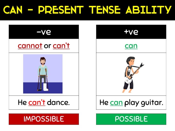
4. Use Color and Shapes Effectively
By now, we’ve got a slide that’s quite easy to read and doesn’t have too much content. But it’s kind of boring. It’s like something you’d see in a business meeting in about 2003 – it looks really PowerPoint-y with all those default colors, gradient text boxes, text box shadows, and default table design. So…
- Clear the formatting from the title text box and use a simple, unedged, strip of color. Let’s also use the whole width of the slide.
- Change the title text box and font to colors that contrast well. I really like the default standard colors in PowerPoint 2016, so I’m going to use the standard yellow on a black background.
- PowerPoint doesn’t like using borders in tables. I don’t know why, but let’s put them back in. In fact, let’s junk the whole default blue theme for now.
- I much prefer table text to be center-aligned. I think it’s easier to read.
- Bold boxes of a single color are better than the gradient fill effect, so let’s use red and green, and make sure we change our font colors so they’re easy to read.
- Our bold color boxes are uneven sizes. In fact, they’re text boxes which are autofitting the size of the text, so let’s replace them with equally-sized shapes instead – they’re a lot easier to manage.
- That blue arrow is looking tired, so let’s pick a standard color for it and give a strong black border.
5. Tidy Up the Positioning
This is looking a lot better, but the positioning of the content is still a bit wonky. You either want to have items aligned with one another or clearly not aligned…. otherwise it just looks a bit lazy, so I’m gonna tidy that up. Adding some borders to the possible/ impossible text will make this easier and PowerPoint’s positioning guidelines (the red dotted lines that appear when you move items) are super helpful here.
6. Add Some Great Fonts
Our slide’s come a long way, but it’s still looking a little dull. We need to liven it up with some cool fonts. Thankfully, the internet is awash with free font sites. Here are some of my favorite fonts (click on the images to link to a download site):

![]()
![]()


![]()
 I particularly love Dyslexie because (as you might have guessed) it’s been designed to be more readable for dyslexic students… and teaching in Thailand, I never knew whether my students were dyslexic or not. This time, however, I’m going for Bangers for the title and Sniglet for everything else.
7. Don’t Be Afraid to Bin the Whole Design!
I’m pretty happy with the slide now, but to be honest I probably wouldn’t design it like this from scratch. Our redesign is clear, with a nice amount of white space, a couple of fun fonts, and it looks a lot more modern. However, it doesn’t grab me and I don’t really like the flow of the slide – there’s a left-to-right table followed by a top-to-bottom graphic. It’s also missing some eye-catching images, so we’ve got a couple more things to do.
8. Make the Slide Flow
I think a top to bottom flow is going to work best here. I’ve got rid of the arrow as I’m not sure it really adds much. Instead, I’ve separated the positive and negative forms and used red and green for emphasis. This time I’m using Lavoir and Sniglet fonts.
9. Use great images
Almost there! Our last step is to add a couple of images. Of course, Google Image Search is great and we all know most teachers don’t really worry about copyright issues for their own materials. However, there are some awesome free copyright-free image sites around now. I’m a big fan of freepik, which I’ve used for the images below, but Creative Commons, Library of Congress, and openclipart are great too. If you’ve got a budget for this kind of thing, then there are some great image packs on Teachers Pay Teachers, such as this pack from Krista Wallden – Creative Clips.
Here’s the final design:
This new design probably took 5 minutes, including finding some clipart, and I’m pretty happy with it. It shows all the information we need. It looks fresh and the images are great. It’s also easy to read – the fonts and colors are clear and the consistent top-to-bottom layout encourages the reader to read the slide as intended.
To finish, here’s a recap of the PowerPoint design principles we covered:
- Less is More. You should only be teaching one new thing at a time so that’s the only information you need on this slide. Save the rest for later slides.
- Bigger is Better. Use large text and graphics so everyone can see.
- White Space is Awesome. It’s a key part of your design – resist the temptation to fill up the screen.
- Reduce Wasted Space. Delete any duplication. Use color and abbreviations effectively. Don’t have anything that doesn’t help you teach this particular topic.
- Use Color Simply and Well. PowerPoint’s standard colors are great. Use a small palette of bright colors. Don’t use too many colors.
- Forget about Drawing Effects. No one wants to see bevels and glows. Simple, bold blocks of color are more effective.
- Don’t be Lazy. Make sure your objects are aligned with one another. Use consistent font sizes. Align your text consistently. Stay away from PowerPoint’s default styles.
- Use Custom Fonts. It takes a little time to find and download them, but they add so much.
- Think about the Flow! Your design should lead the reader’s eye around the slide in a logical order.
- Use Awesome Images. They’re easy to find and make your slide much more eye-catching.
Credits
Image of man with broken leg: Designed by Makyzz / Freepik
Image of boy playing guitar: Designed by Freepik

One thought on “Up Your PowerPoint Game”